
––
RESPONSIBILITIES
• User Experience
• User Flows
• User Interface
• Prototyping
––
DESCRIPTION
One of the biggest challenges for data scientists is having a centralized place to share their work—this is what led to the creation of Outputs within the DS Cloud platform. This feature delivers insights to an organization by allowing data scientists at the company to run, consume and publish their discoveries into easily accessible, collaborative reports.
The following flows, sketches, screens and interactive demos show some of the main points of focus for the design process:
1. Outputs: One easily accessible location (dashboard) for sharing insights of a team's project. The main items that live here are Deployments and Reports.
2. Reports: Mentioned above, these live within Outputs. They are reproducible documents for sharing knowledge and insights across a company, but I've isolated them as a second item here because the design process was so in-depth.
REQUIREMENTS INTO USER FLOWS
Upon receiving the requirements, we created a cohesive set of user stories and translated them into user flows to fully understand the various functions of Outputs.

WIREFRAMES:
After successfully settling on what felt like the most user friendly set of task flows with all paths accounted for, we moved into the wireframing process. My goal was to create an experience that was easy for all users, whether its Data Scientists, managers or executive team members viewing an output.
I solved for this by creating an easily scannable card system view within the platform. Users rely on this view to provide a larger overview of ongoing outputs that viewers can sort, filter and search. Below I've included a few of these wireframes.

VISUAL DESIGN:
Once I had the wireframes ready to go and approval from the team, it was time to jump into visual design. For me, it was really important to create an easily scannable interface that a user could look at for extended periods of time. The light color palette with little pops of color really helped to highlight the important details without overwhelming the user.

REPORTS
Data scientists need the ability to surface the importance of their work. The problem we faced here was designing a tool that would create easily digestible reports for not only fellow data scientists to parse, but also company executives.
To give a bit of context here, reports are hackable, reproducible documents for sharing knowledge across a company. These can come from a variety of sources including Jupyter notebooks, R Markdown, and other files from your repo.
We wanted to make something that didn't require extra work for the data scientist, but could also be quickly consumed by nearly anyone at the company with little to no coding knowledge. We landed on a new, innovative approach that allows data scientists to build their report in their python notebook and publish it directly from there notebook into what essentially a medium post.
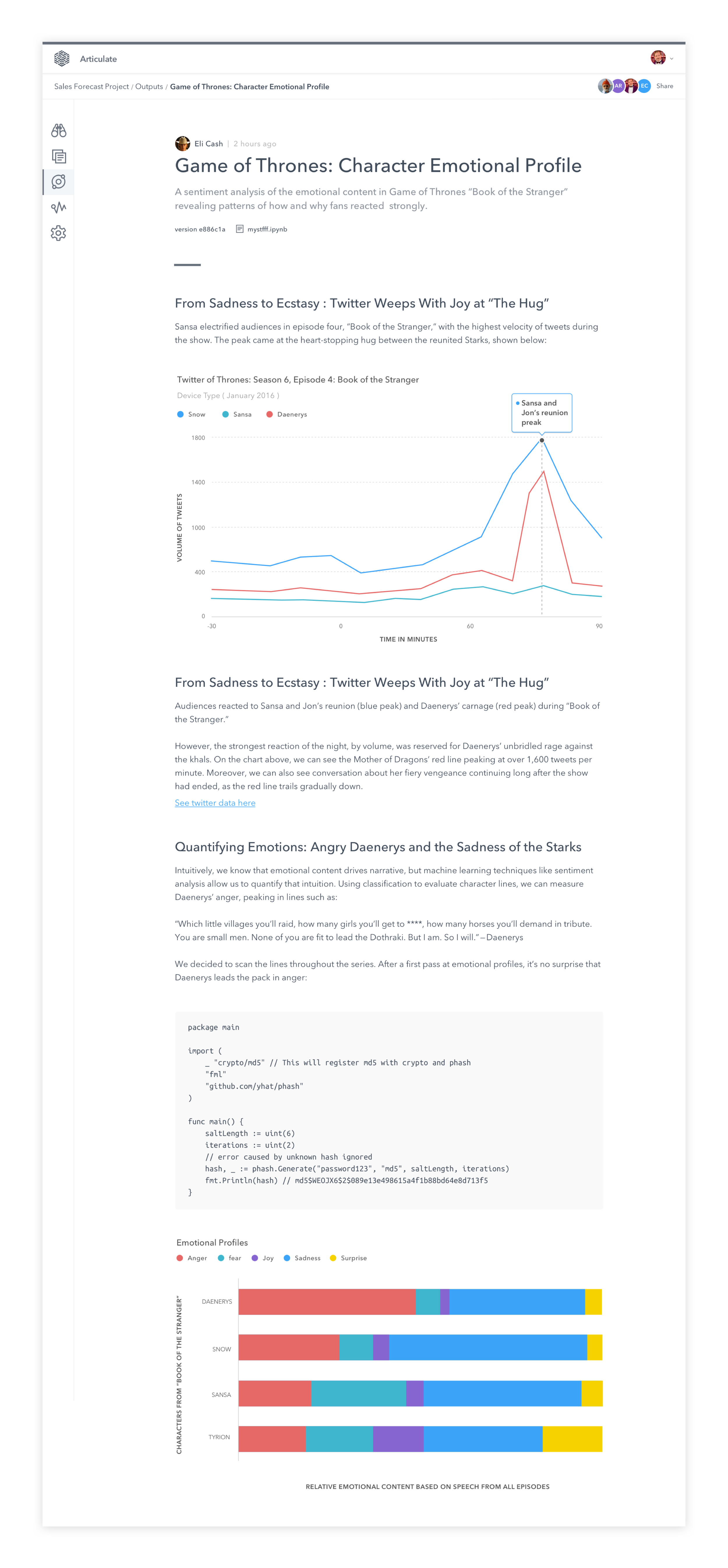
Published Report
This is an example of a published report. Here, a user has translated the content from their markdown or Jupyter notebook into a beautifully formatted post.
Giving users the power to take that live code, equation or exploratory text and create an editorial style report allowed the opportunity to nerd out designing a rich article template.
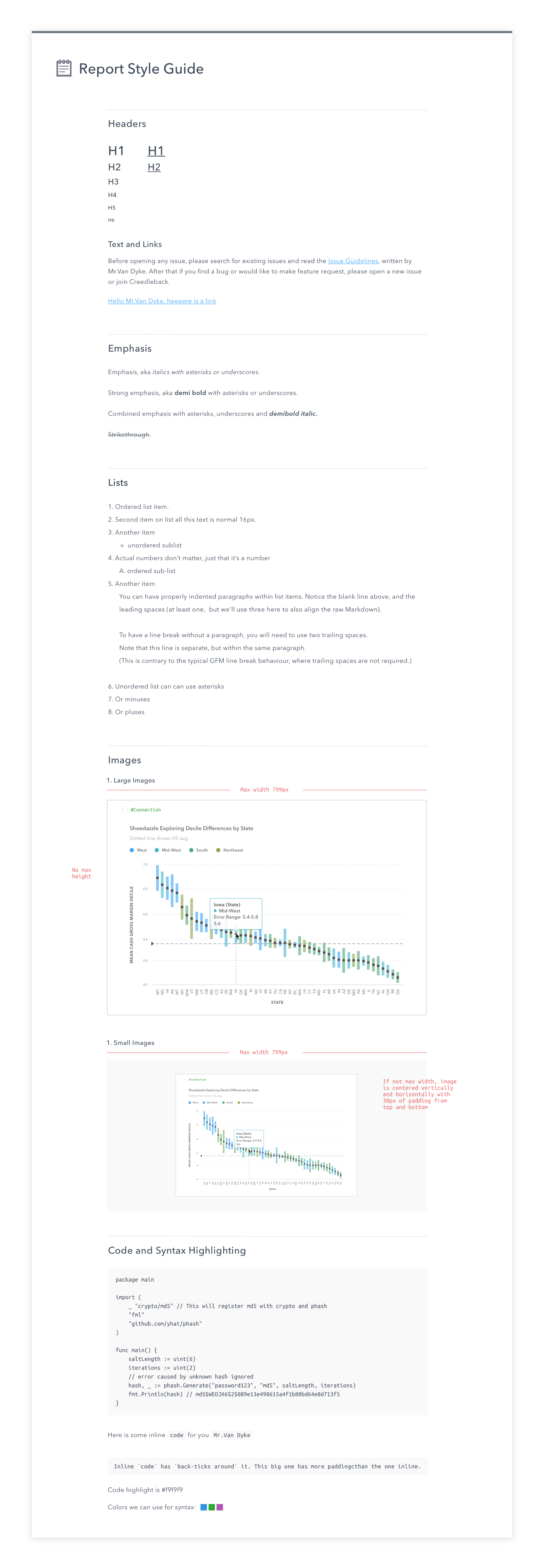
Once designed, to properly leverage this template, we needed a comprehensive style guide—see below.
Style Guide
I created a robust the style guide that had to be capable of encompassing everything data scientists do in their explorations i.e.. code blocks, visualizations, etc.
Feature: Share & Collaborate
Outputs also allow you to quickly share your outputs and reports with teammates. The process for adding a teammate to a project is shown here.
The biggest challenge was creating something that felt familiar and easy to use, yet lightweight. We stayed away from a full screen modal approach and opted for this quickly accessible popover.