––
RESPONSIBILITES
• User Experience
• User Flows
• User Interface
• Prototyping
––
DESCRIPTION
Creating the “Projects” experience of our subscription-based data science platform has been equal parts rewarding and challenging. Understanding the field of data science as a new-comer was no easy task—so one might imagine that creating an efficient way for data scientists to organize their work was quite a challenge.
A lot of research and user interviews went into creating the best solution for this problem. Our solution promotes visibility for data science teams’ work by organizing their code, data, and analytical outputs into a single dashboard-like view called “Projects”.
The case study below offers a glimpse into the process of bringing this solution to life with a focus on two of the key experiences:
1. Create Project: Getting started on the platform
2. Projects: A dashboard for tracking and accessing projects
INITIAL EXPLORATION | THE RESEARCH
The initial exploration started with a set of requirements created by our strategy team. Once I received the requirements, I took it upon myself to do some initial research of the competitive landscape to see how other companies were handling project creation and dashboard experiences. I didn’t limit myself just to companies in the data science field, but instead looked far and wide to help better understand the problem.

REQUIREMENTS INTO USER FLOWS
The next step was to translate the requirements into user flows. Lots of them. My primary focus here was determining how users could efficiently create new projects and access them once created. I had to consider use cases for both brand new users and existing users.

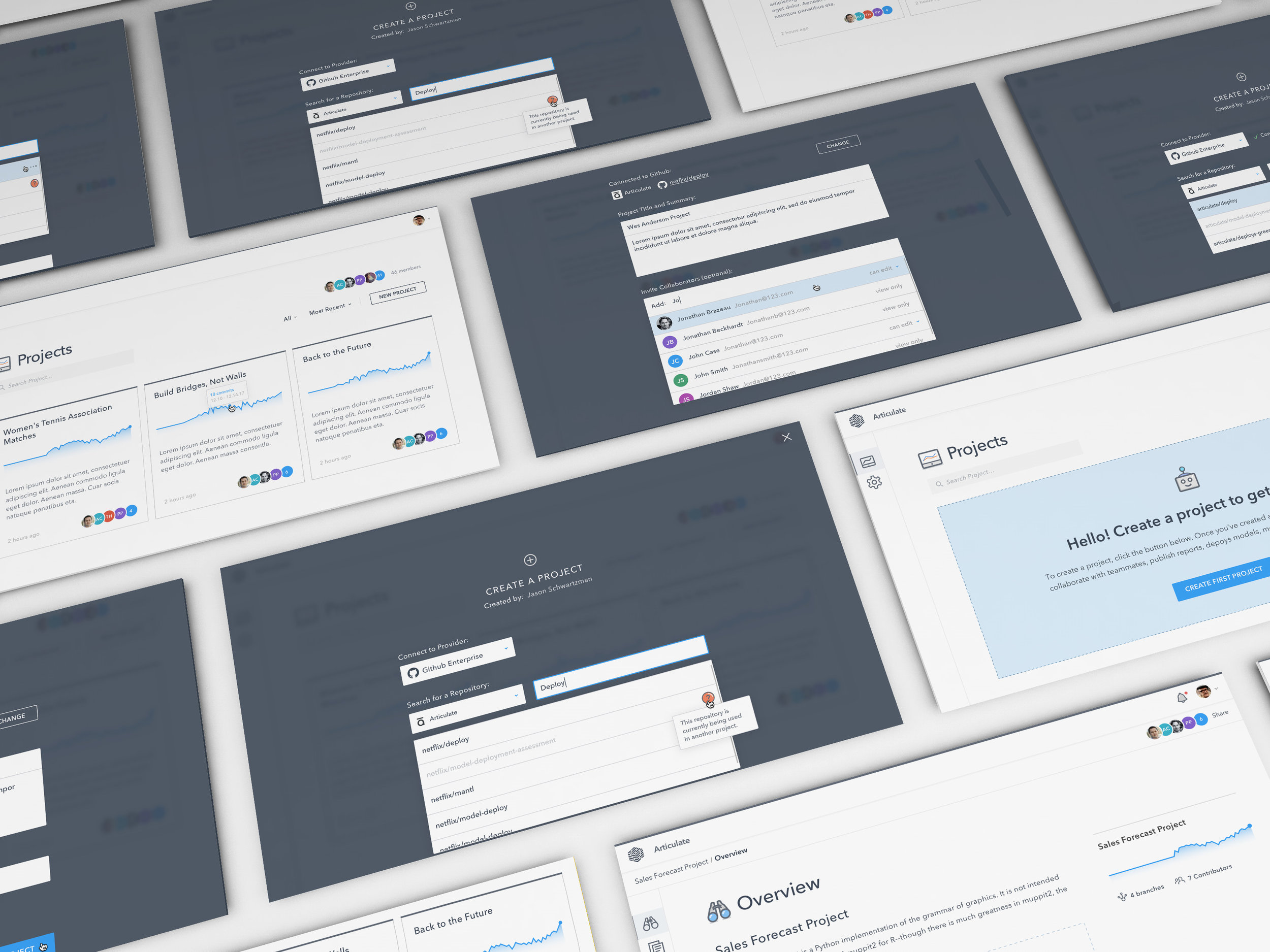
LOW-FIDELITY WIREFRAMES
After successfully settling on what I felt was the most user-friendly set of task flows and getting the team onboard, I moved into the wireframing process. The first goal was to quickly sketch out key screens in a low fidelity, pen & paper format to get my initial ideas out. This helped both me and the team to wrap our minds around the problem further and quickly run ideas past our dev team as we explored.

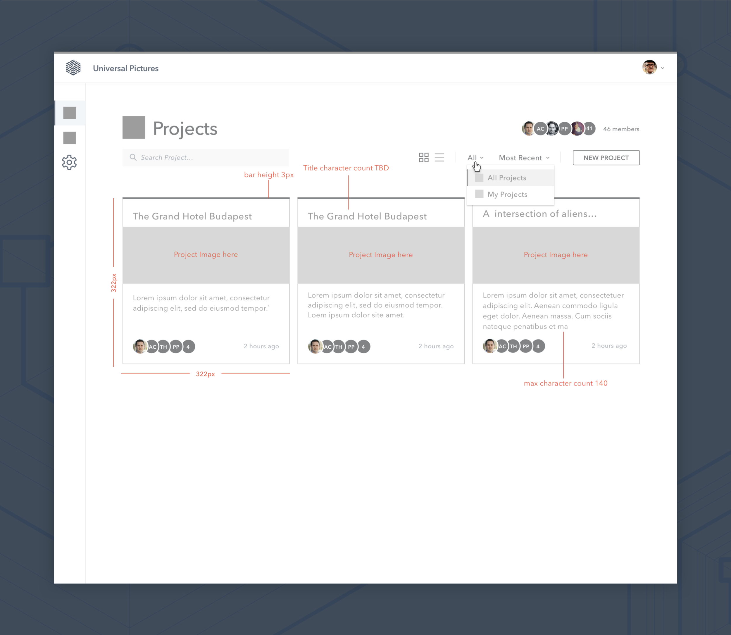
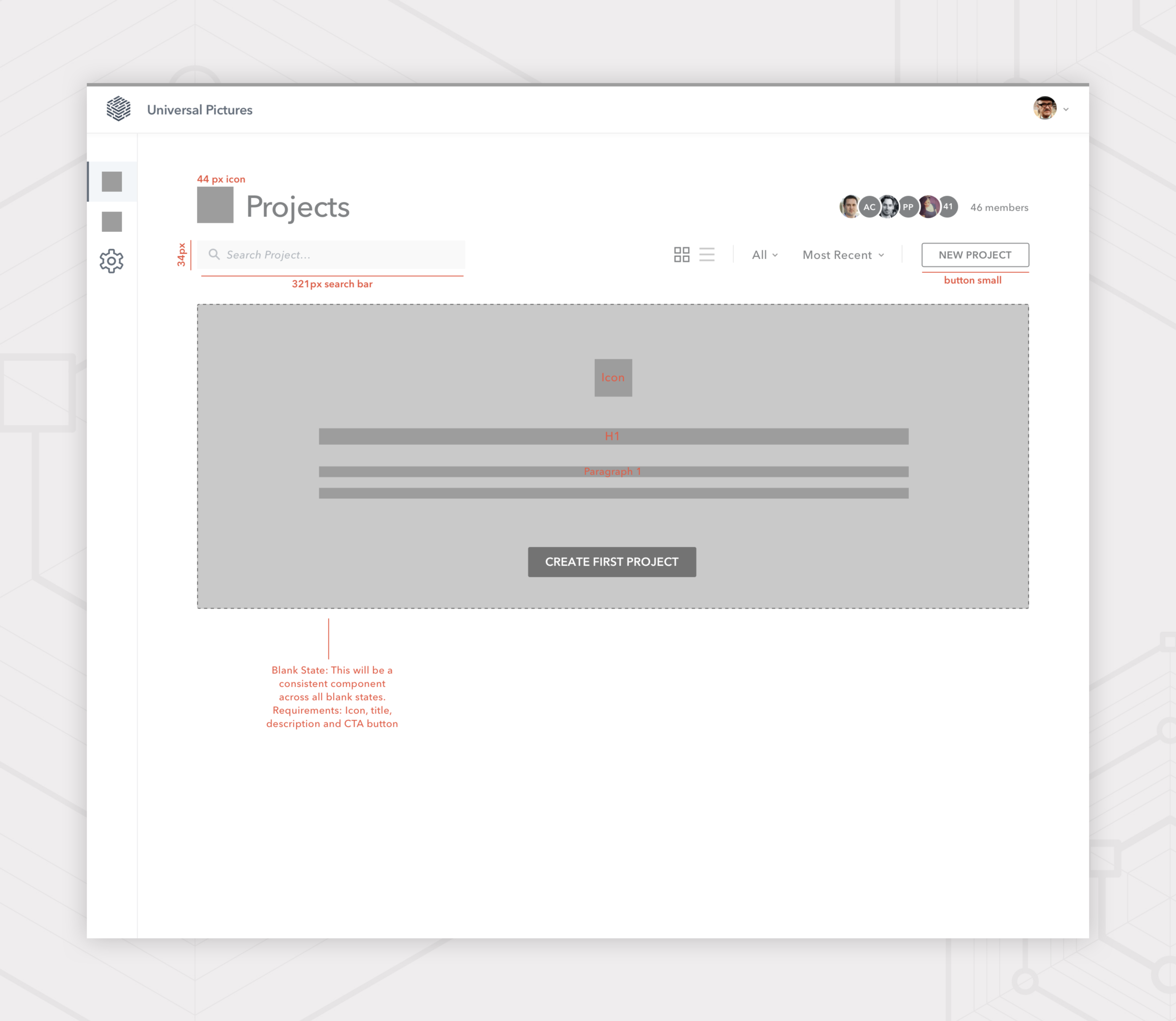
HIGH-FIDELITY WIREFRAMES
Once I had fleshed out a substantial set of initial sketches, things started to take shape. From there I moved into high-fidelity wireframes to really help solidify the designs. This process is really where things start to feel real, but it’s important to keep looking for holes in the thinking even at this state in the process. More on that shortly...
UI Design
Creating a cohesive set of hi-fidelity wires was fantastic for helping to provide a real picture of the app. The discovery didn’t stop there though…Once we moved into the visual design process, the nuances of the app started to really come together.
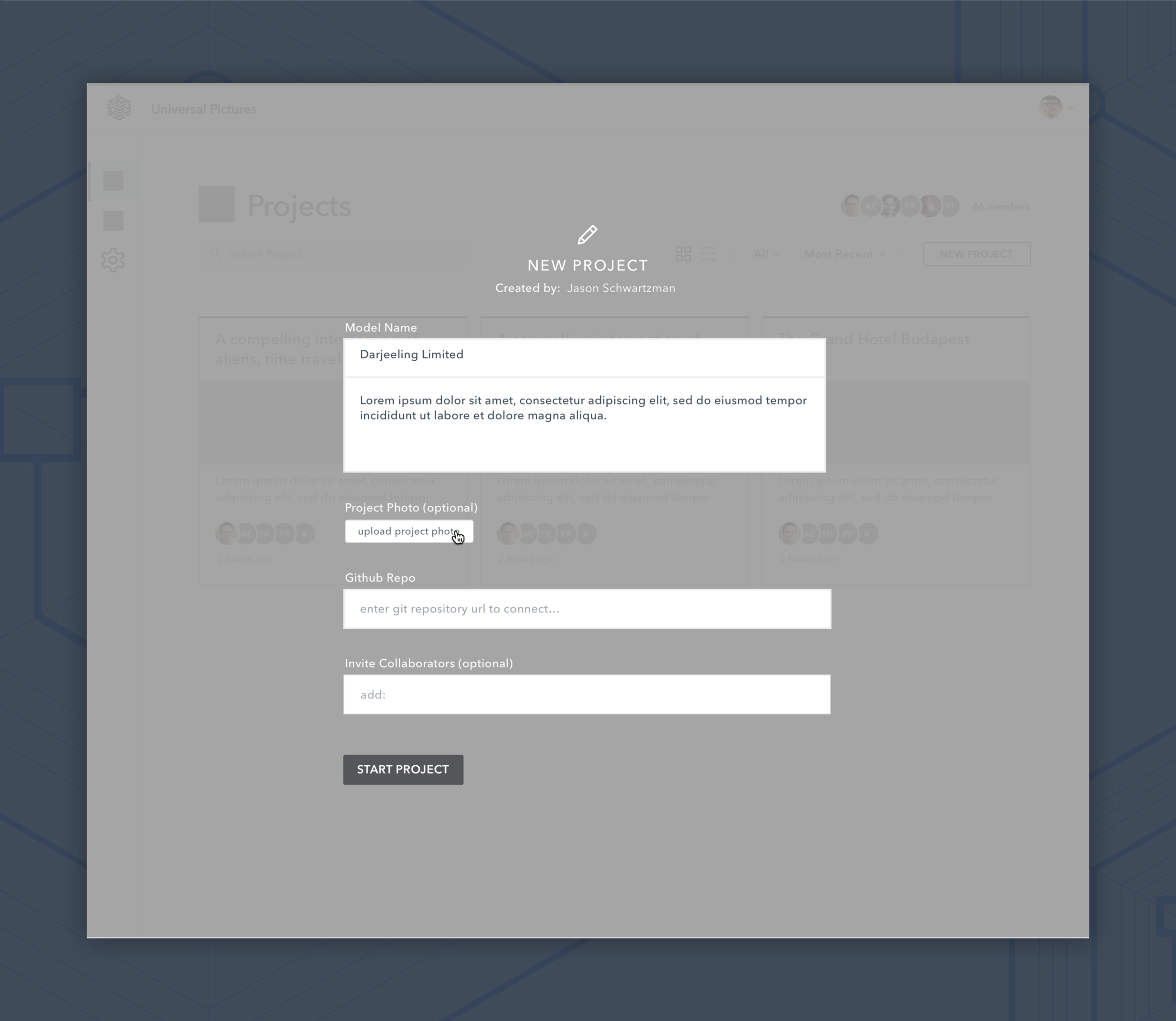
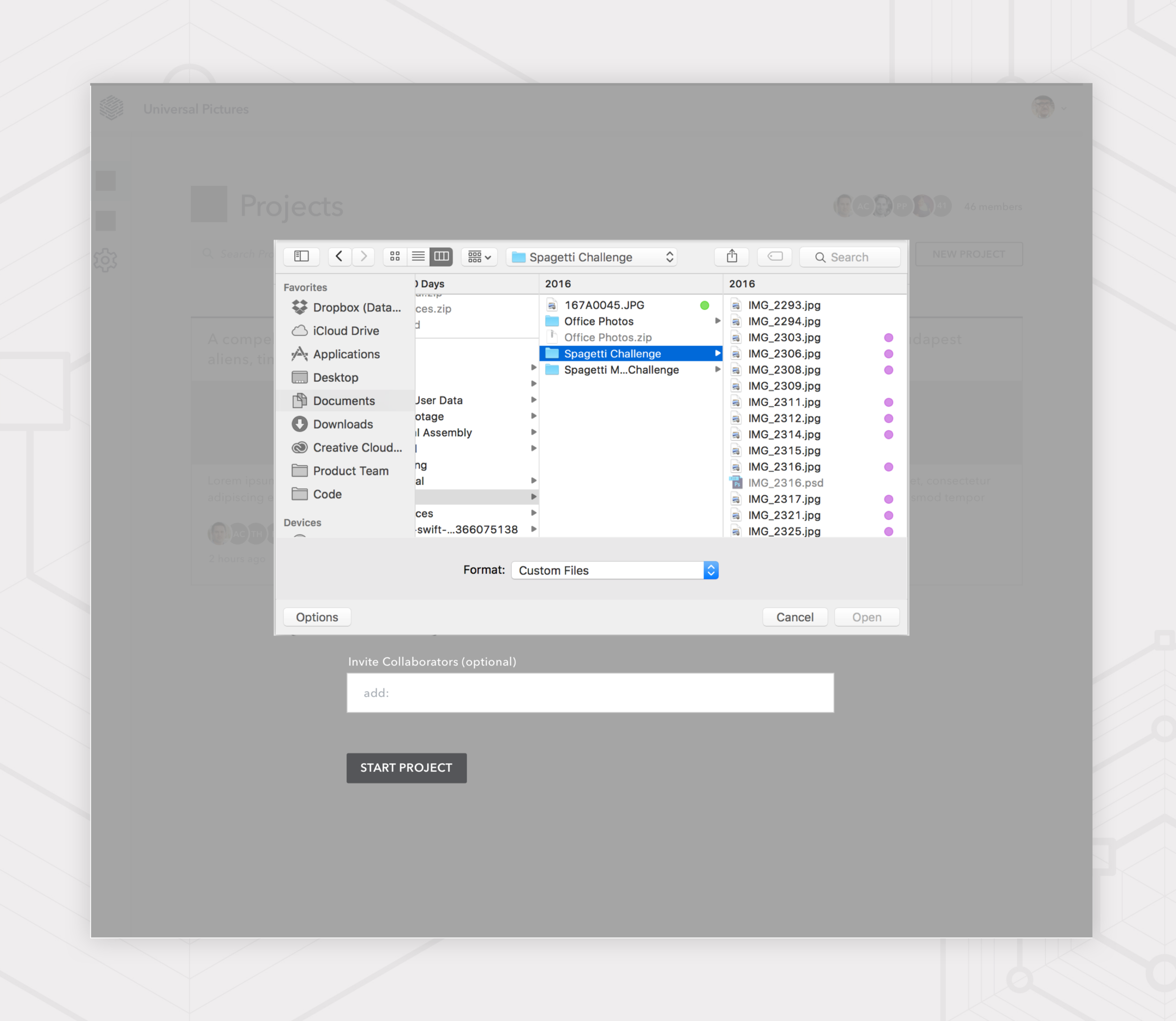
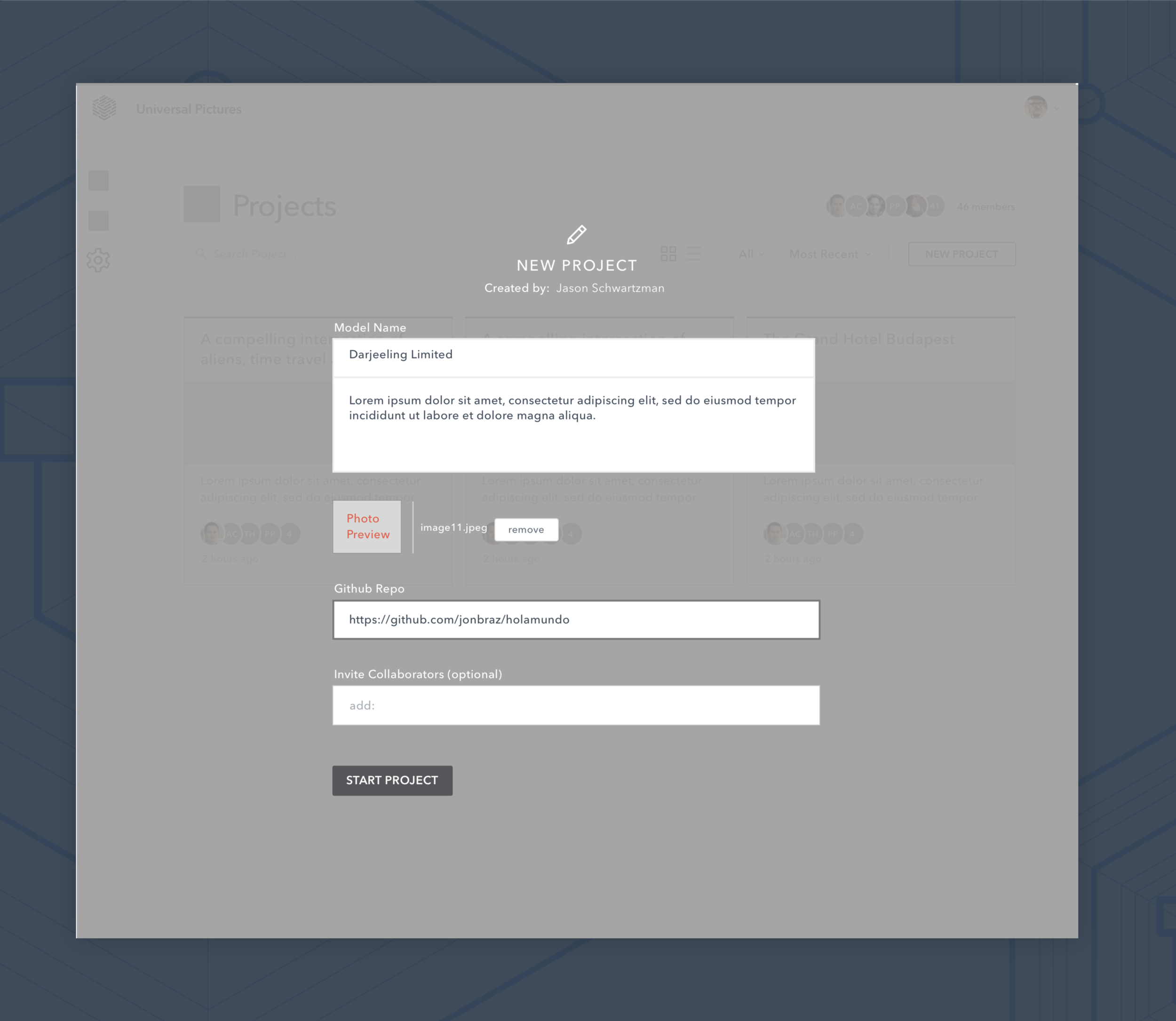
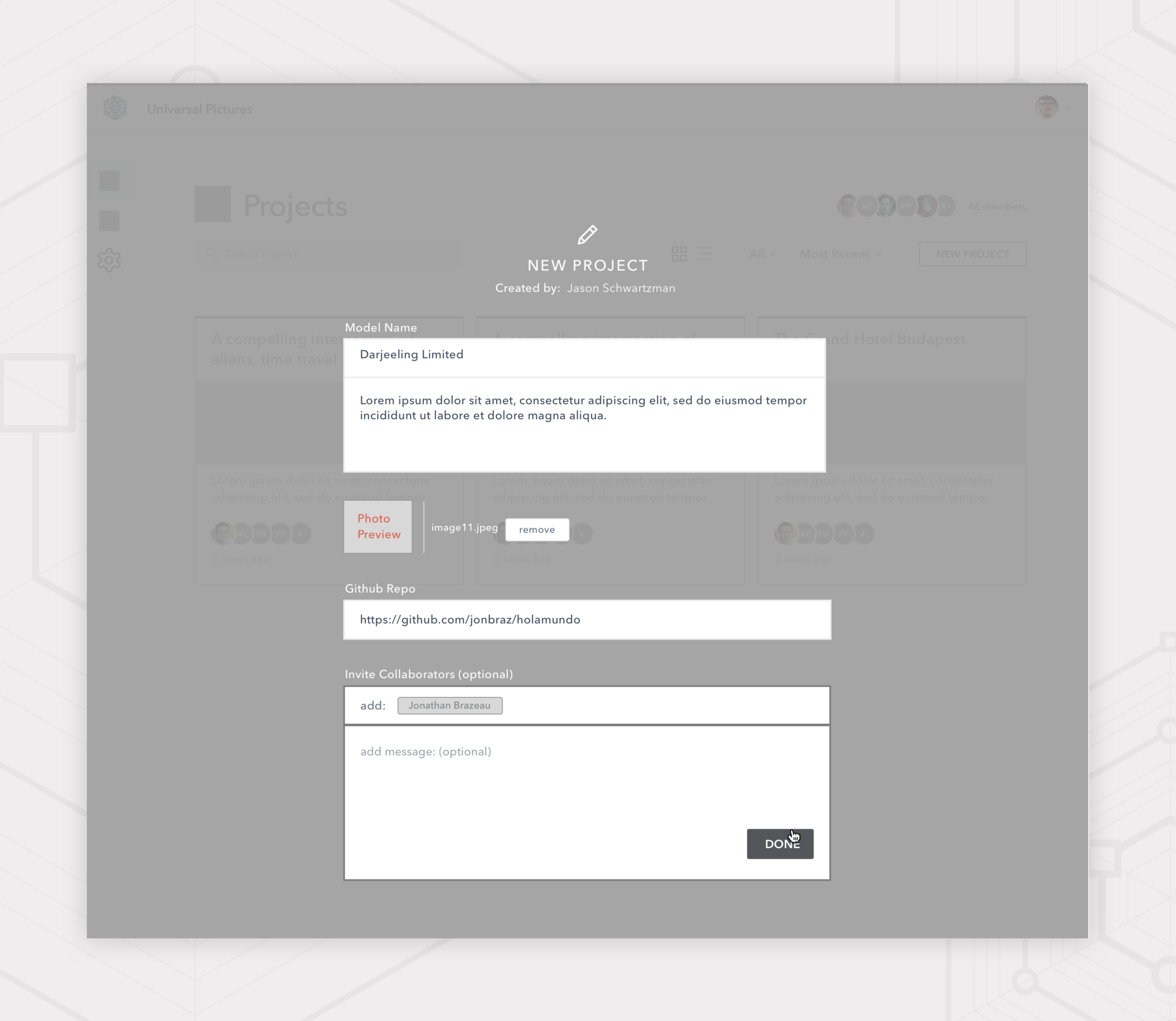
Our Create Project flow felt a little confusing with the long, fully exposed form approach we’d chosen. In playing further with the elements we’d defined, I found a progressive disclosure system to work better from a hierarchical standpoint.